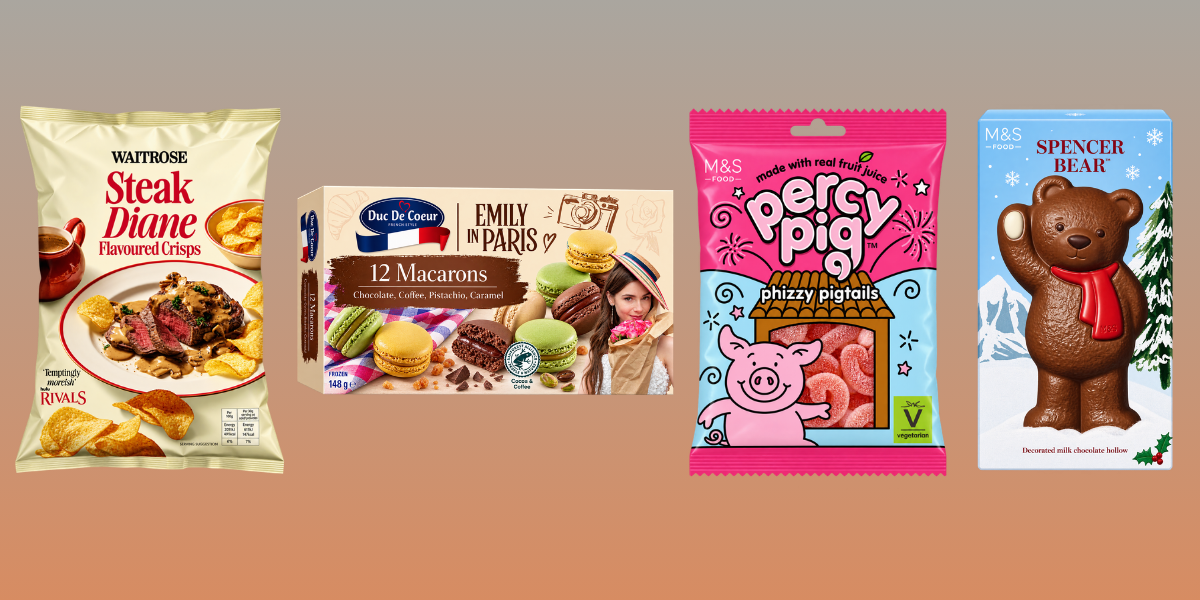
Shoppers are spending more mindfully, and private label is closing the gap, upgrading its packaging and earning trust that used to belong to name brands. For a brand in the middle of the price tier, the pack has to read premium at shelf in about a second, or it competes on price alone.
Over three studies in this series, we tested food, beverage, and personal care packaging against the same scorecard and asked the same question of each: what separates the packs that read premium from the ones that don't? Each category gave its own answer, dark contrast and illustrated scenes in food, texture and provenance in beverage, credentials and ingredient stories in personal care. On their own, those answers look category-specific, the kind of thing that only helps if you happen to sell mustard, or gin, or serum.
So we distilled our findings across all three categories into five more universal principles, the moves that hold whatever a brand is selling. Some travel cleanly, some travel with a named exception, and one reverses depending on what the shopper is deciding. Here is what carries from one aisle to the next.
1. Put something ownable where the category name would sit
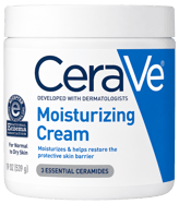
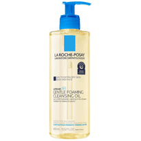
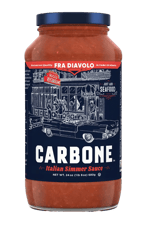
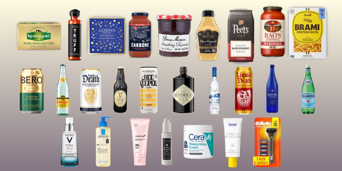
The strongest packs do not lead with what they technically are. In beverage, none of the four highest-scoring packs put the category in the headline, it stays on the pack but never runs the show. The same sentence describes Vichy, CeraVe, and La Roche-Posay in personal care almost word for word. Food reaches the same place through a different device: Carbone does not foreground "tomato sauce," it puts a restaurant and a vintage Cadillac there instead.
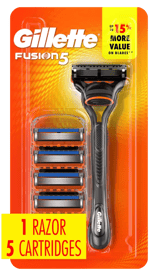
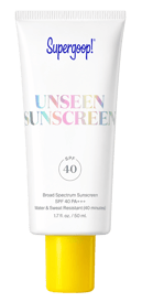
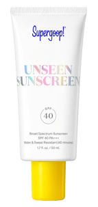
The exceptions prove the point rather than break it. Gillette still needs the word "razor" prominent, because a five-blade cartridge system has to be navigable in a way a mustard does not, and Supergoop builds "Sunscreen" into its product name. Where a shopper is choosing between functionally different formats, the category name earns its place back on the front. Everywhere else, that space is better spent on something specific and ownable.
2. Commit to a restrained color system.png?width=286&height=286&name=Grey%20Goose%20Vodka%20(750%20mL).png)
Every category's winners discipline their palette. Food commits to one dark background and a single high-contrast accent. Beverage commits to two dominant tones and one accent. Personal care commits to a single color across an entire range. The principle is identical everywhere: fewer colors, chosen on purpose and repeated without exception, beat a busy palette.
Two colors recur strongly enough to build toward. Gold appears on five of the six strongest food and beverage packs, breaking only for Grey Goose's frosted glass. Blue holds for half of personal care's strongest packs, with Supergoop moving to yellow and medicube to a color-coded system on purpose. Gold is close to a rule in food and beverage; blue is a strong default in personal care. Either way, the discipline matters more than the specific color.
3. Give the logo something extra to carry

None of the winning packs settle for a flat logo. In food and beverage, what gets added is usually physical: a foiled crest, a motif embossed into glass, an illustrated scene. In personal care, it is usually informational: a dermatologist credential doing the same job a foil crest does on a bottle. Texture in one, credibility in the other, but always something more than the name.
The strongest packs refuse to choose. Vichy is the single highest-scoring pack in the personal care study, and it carries both, a bottle sculpted into the shape of the volcano its water is named for, mineral bubbles suspended in the gel, and the clinical credential on top. The category's best pack is proof that texture and credibility are not alternatives. They are both worth having if a pack can carry them.
4. Distinctiveness always travels with a quality cue
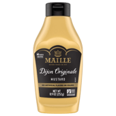
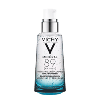
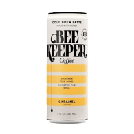
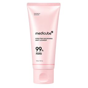
Being different and being premium are not the same signal, and none of the strongest packs send one without the other. Maille's crest is unusual for a mustard bottle, and it arrives with a founding date that frames the difference as heritage. Vichy's volcano-shaped bottle is unusual for a serum, and it arrives with a clinical credential. medicube's red cross is unusual for a cleanser, and it arrives with a named, sourced ingredient. Beekeeper makes it most explicit: the most unique pack in its set still reads premium, because the distinctiveness comes with the honey story attached.
Distinctiveness on its own reads as loud or strange. Distinctiveness paired with an explicit reason reads as considered. The difference is not how far a pack departs from its category, it is whether the departure comes with something that explains it.
5. Match the claim to the question the shopper is asking
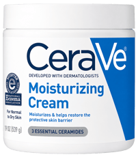
Premium is category-specific, and this is where a single tactic can reverse. In food, a functional spec, a protein count or a macro flag, reads as commodity and works against premium, which is why the winning food packs keep it off the front. In personal care, a functional spec, a clinical percentage or a dermatologist claim, is the entire premium argument, and CeraVe builds it into the logo.
Same kind of claim, opposite effect, because the categories answer different questions. Food answers "will I enjoy this." Personal care answers "is this safe to put on my body." The travelling principle is not hide the spec or lead with the spec, it is read the question the shopper is actually asking, and let that decide whether the spec belongs on the front.
Principles, not templates
These five principles hold across food, beverage, and personal care, which is exactly why they are worth building toward. But we recognize that no two packs, or categories, are the same. A principle points you in the right direction; it does not guarantee your pack lands. That is why even with these principles in hand, brands still need to test rigorously, to diagnose whether their pack is doing what it was designed to do, in its own category, against its real competition.
Most brands find out what their pack is signaling after it ships. It does not have to work that way. If you want to see how your pack performs before it reaches the shelf, get in touch
Contact us today to learn more.
Read our previous blogs:
Food - Premium Presence on the Food Shelf: Three Moves that Signal Luxe
Beverage - Premium Presence on the Beverage Shelf: Three Moves That Signal Luxe and Drive Choice
Personal Care - Premium Presence on the Personal Care Aisle: Three Moves That Signal Luxe and Earn Desire