Everyone wants more energy as we come out of our COVID cocoons. The market is listening as there seems to be a new energy drink hitting the shelves every other week. These coffee alternatives are certainly not for everyone, but the size of the prize is huge and getting bigger. According to the Allied Market Research report: “The global energy drinks market size was valued at $45.8 billion in 2020 and is expected to grow at a CAGR of 8.2% to reach $108.4 by 2031”.
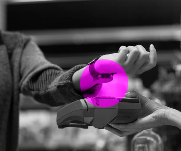
As such, entrants into this space and existing stalwarts should expect to face stiffer competition for valuable space in convenience cooler doors. Your packaging needs to be up to snuff or you will risk irrelevance and de-facing. Luckily, there are tons of tips and tricks to leverage to make sure your packaging is nailing the basics – communicating the product benefits, removing any potential barriers to purchase, and ultimately being seen, selected, and sold. Consider the below to make sure your energy drink package is working overtime to drive conversion!
- What kind of energy drink are you? As the category grows, energy drinks themselves are becoming more fragmented. As I see it, there are three “energy drink identities”: standard, performance, and BFY (better-for-you).
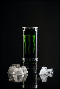 The standard energy drink (think Rockstar, RedBull, Monster etc.) is “your dad’s energy drink” and probably what immediately comes to mind when you think of the category – carbonated, flavorful sips aimed to give you a mid-day jolt. More recently, there have been a proliferation of performance based and BFYs. Performance based energy drinks grant energy but also have some secondary sports or exercise benefit (think C4 or Bang with their hits of protein and creatine for promoting muscle growth). Finally, we have seen the emergence of BFY energy drinks (think Celsius) aimed at fighting the stigma surrounding the category (jitters, additives, chemicals etc.). Once you know who you are, it will be easier to decide how to dress!
- X Marks the Spot – Do you have a strong “Bull’s-Eye”? The Monster “Clawed M”. The gigantic star on the RockStar can. Bangs stylized, cross-haired “b”. I’m sure as you were reading this, you were able to picture at least one of these icons. A giant, honking logo on your can is typical of the category and can help create a strong visual identity and brand block at shelf. Consumers are used to and expecting this so invest some time in coming up with a cool, memorable logo that can draw the shoppers’ eyes to your products.
- Tout your benefits. If you are BFY, lean into your natural ingredients. If you are looking to promote exercise performance, you can highlight the benefits of a boost of protein or creatine your drink provides. In a sea of competition, what is setting you apart? If the answer is an immunity boost, a shot of electrolytes, or something else, make sure your consumer knows it! These benefits should not be an afterthought. Consider placing them near your logo or locking them up with your branding to ensure you are getting eyeballs on these key selling points! Also, make sure your benefits are lined up with your brand and proposition. If you have a longstanding reputation as an indulgent or sugary brand, that might be a barrier to consumers “believing” that your drink is able to improve mental focus. In this case you can lean into your taste/flavor advantages instead. Speaking of…
- Go crazy! This is especially relevant if you are a standard or performance-based energy drink – insane, creative flavors can drive trial! This is a fun category … Have some fun! People are expecting you to get a little silly. What sounds more energetic: “Grape,” or “PURPLE PULVERIZER!!!” Unique nomenclature is common in craft or artisanal subcategories and may entice consumers to pay a smidge more. Reign literally has a flavor called “Watermelon Warlord”… Can you top that?! Additionally, there is a potential to cue premium with interesting flavor names with corresponding can colors.
- But treat BFY a little differently… BFY energy drinks are likely to have a slightly different audience and should be packaged accordingly. White is always a strong color to start with when trying to cue better for you or natural but may make you blend in with your competitors. Consider where you will be on shelf and make sure your colors are subtle enough to cue health but strong enough to break through. A semi-realistic ingredient visual can keep you grounded in the ‘natural’ space, and you can be a little more subtle with your flavor names and choices.
Follow those tips and tricks and you’ll be well on your way to filling your consumers energy tanks as the top choice at the cooler door! Contact us today to succeed in the energy drinks category.
 THE AUTHOR
Steve Honovich is a Director of Client Development at Behaviorally and his own health and fitness journey inspires him to constantly seek out new and exciting foods to incorporate into his nutrition plan. Before falling in love with market research and data analysis, he had completed coursework to become an NASM certified personal trainer. Questions about packaging? Or Exercise? Reach out to Steve on LinkedIn!