|
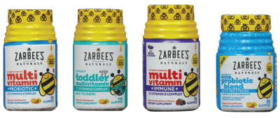
Zarbee’s Naturals desired consistent visual brand identity across its specific consumer targets (infants, children, adults) in order to drive increased presence on shelf via a more unified and distinctive appearance.
Adopting uniquely ownable elements (both structure and graphics) and creating clear visual cues for discerning variety differences enabled Zarbee’s Naturals to strengthen its presence on shelf, reinforce communication of its core natural positioning, and promote shoppability.
Following the introduction of this new packaging, market share for Zarbee’s Naturals doubled in just a matter of months after launch. |

Data intelligence to own the most valuable moment in marketing: when a purchase transaction occurs. |
Explore this and other case studies in 'The Power of Packaging to Drive Purchase Transactions,' our guide that provides data intelligence to the world’s leading brands to keep pace with the complex challenges presented by today’s physical and digital retail environments. Compiled over 50+ years of packaging tests, it now integrates insights from our cutting-edge, AI-powered product stack.


