|
 BUSINESS CRITICAL ISSUE BUSINESS CRITICAL ISSUE
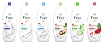
Dove is a category leader in the skin cleansing category. It remains proactive about having relevant packaging and began a restage in late 2018. Research began with exploring visual equities to guide the redesign and culminated with validation of a new design system in 2019.
 LEARNING LEARNING
The updated design leveraged Dove equities, retaining its strong shelf presence as well as brand values (moisture, superior skin care). The new design launched in early 2020 to much success. The brand garnered incremental distribution and household penetration gains.
 GROWTH OUTCOMES GROWTH OUTCOMES
The new design launched in early 2020 to much success. The brand garnered incremental distribution and household penetration gains.
|

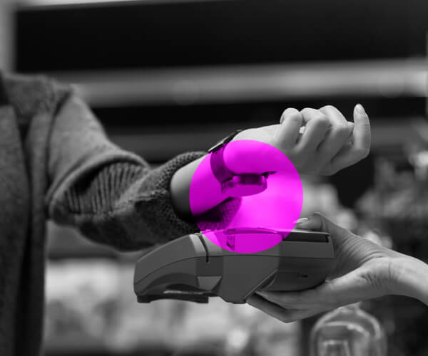
Data intelligence to own the most valuable moment in marketing: when a purchase transaction occurs.

|
Explore this and other case studies in 'The Power of Packaging to Drive Purchase Transactions,' our guide that provides data intelligence to the world’s leading brands to keep pace with the complex challenges presented by today’s physical and digital retail environments. Compiled over 50+ years of packaging tests, it now integrates insights from our cutting-edge, AI-powered product stack.